Billy Strings Concert Poster
The Sketches
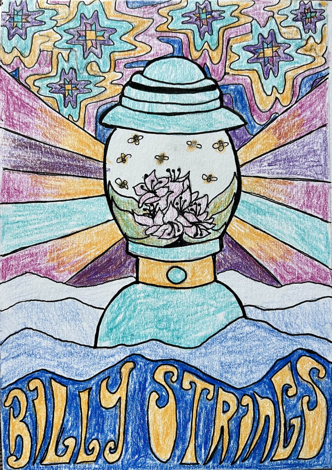
In with the ideas. This concept features a lantern in homage to themes of travel present in Billy Strings’ songs. The lantern is filled with rhododendrons and fireflies and is nested in the Blue Ridge Mountains, all of which speak to the show’s Asheville location. In the sky are the quilt-style stars of traditional Appalachian craft. The stars are ringed by brightly colored concentric shapes, evoking the 70s and psychedelia.
It was love at first email when Billy Strings’ team asked me to design the poster for their 2025 Valentines’ Day concert. The project started with a list of dos and don’ts sent to me by the team. Do: bright colors, psychedelic vibes, aesthetics from past or future decades, inspiration from the concert location and music. Don’t: dark and depressing, illustrations of the band, instruments, certain animals, specific numbers. With these guidelines in hand, I started sketching.
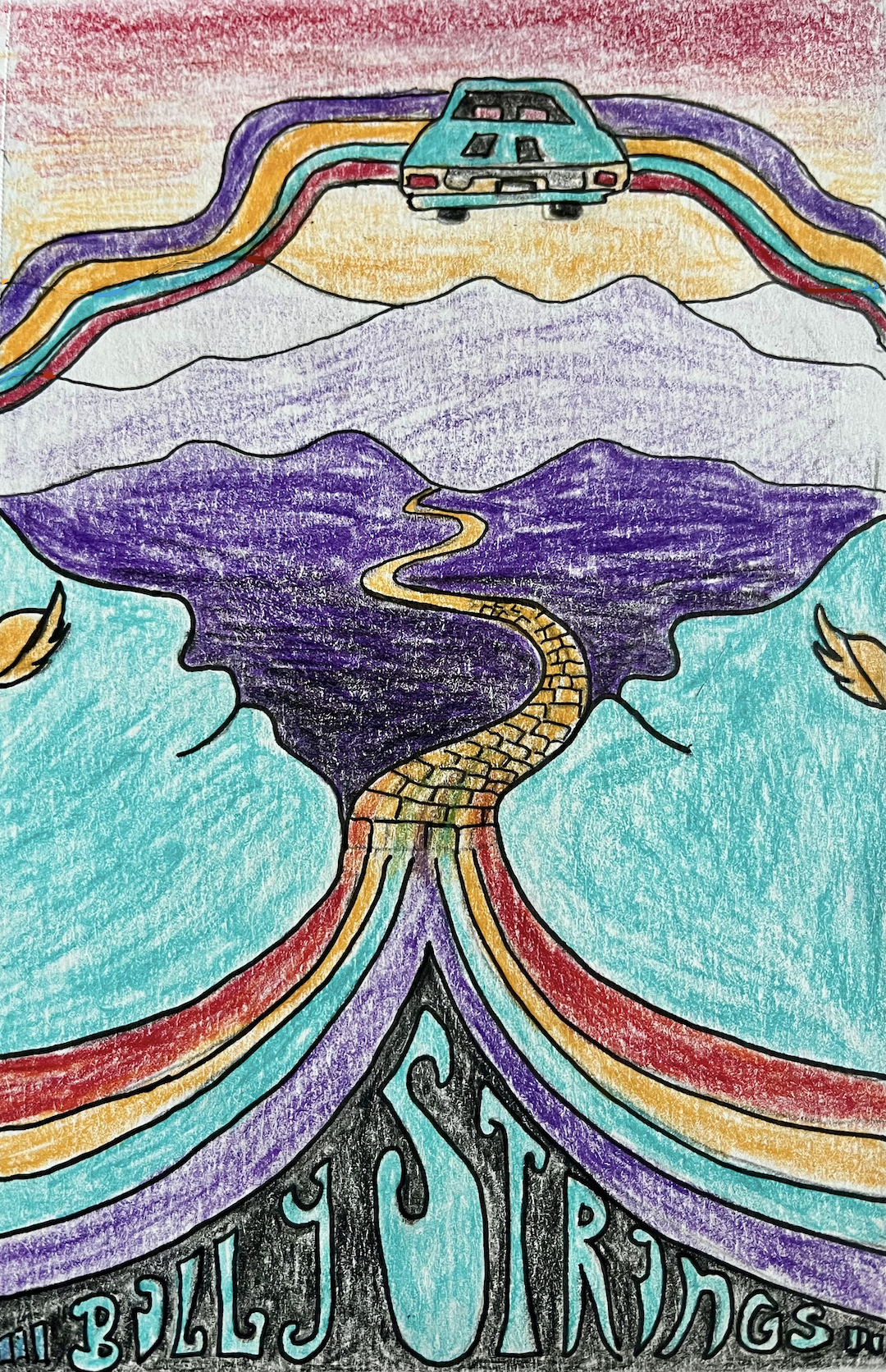
Let’s get real surreal. This concept leaned into the weird, the surreal, and late 70s design. It features the Blue Ridge Mountains with two faces as the front-most mountains. Rainbows fade into a yellow brick road that weaves through the mountains, signifying a path to "Oz" or a magical place. Floating in the sky is a vintage car, seen from the back, that symbolizes themes of travel and Billy Strings’ penchant for vintage cars.
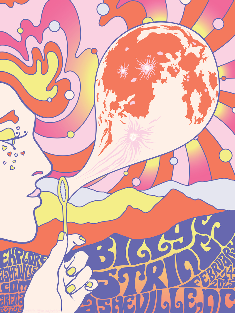
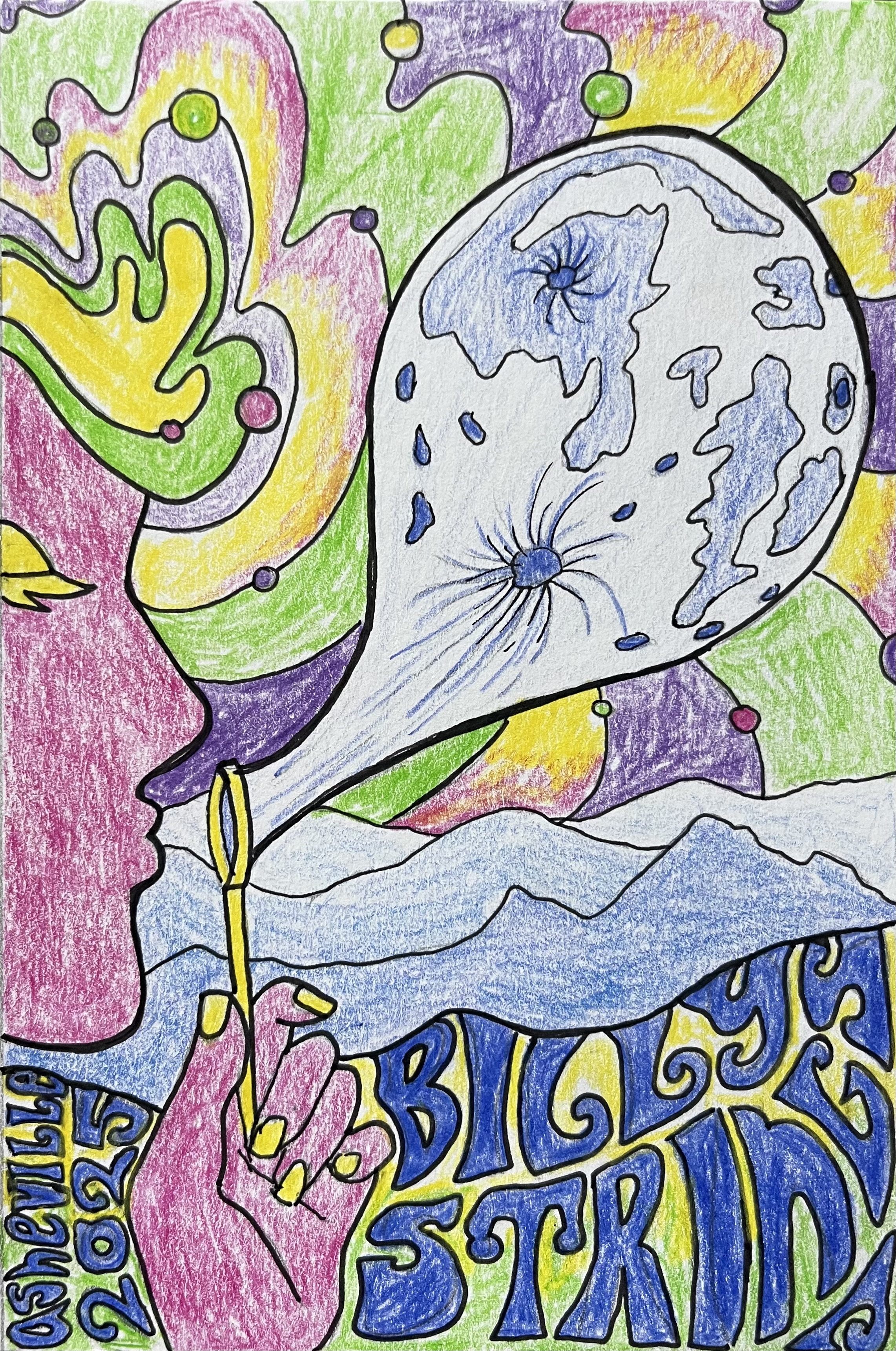
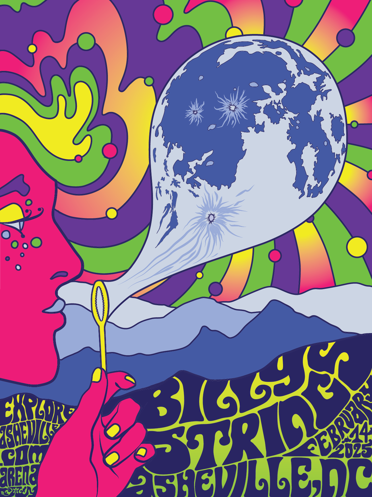
Welcome to the winning concept. Inspired by 1970s art and the work of Peter Max, this idea leans heavily into surrealism, the unexpected, and psychedelic vibes. The focal point is someone blowing a bubble that looks like the moon. The Blue Ridge Mountains at bottom honor the concert’s Asheville location, and the mountains and the moon nod to the nature-focused elements of Billy Strings's songs.
The First Draft
I wanted this poster to be graphical, bold, and crisp, since those qualities make for an eye-catching poster. So, I chose to make the work digitally in Adobe Illustrator.
My first draft featured bold, bright, psychedelic colors, as encouraged by the project brief and inspired by the 1970s. I made some improvements from the sketch, opening the eye and adding freckle-like dots to break up the big, pink block of face. I also added additional text requested by the client.
The Final Product
The Final Product
The team loved the image, but asked me to incorporate Valentine’s Day elements and colors, since the concert was on February 14th.
Keen to avoid Valentine’s Day’s cliché pinks, reds, and purples, I chose a new palette inspired by candy hearts. The poster was limited to seven hues, so I got creative with contrast and colors. I also changed the dots on the face to small hearts as a subtle nod to the holiday.
The poster was a success and, according to reports, sold out before the concert officially began.

